Helping agents finish their shift without calling support
KDV Group
|
B2B
|
Senior Product Designer
|
Compliance
|
Support reduction
The Trade Agent Personal Account lets agents collect cash payments from retail locations. By law, every cash payment has to be fiscalized through a cash register before it counts as received. Otherwise it doesn't exist for tax purposes.

Results
This is a legal requirement, not a growth feature. There's no conversion metric. Success means agents can close their shift without a support call.
Shipped to production. The UI model is built entirely around a compliance state machine, not a product hypothesis.
Kept a manual refresh action specifically for agents in low-connectivity regions, after automated retry alone proved insufficient.
What I owned
Designed the payment list, receipt detail screen, and incassation flow around the fiscal check lifecycle
Defined the error and blocking states where a printed fiscal check can no longer be simply deleted
A check is not a payment, but the app was treating them as one thing
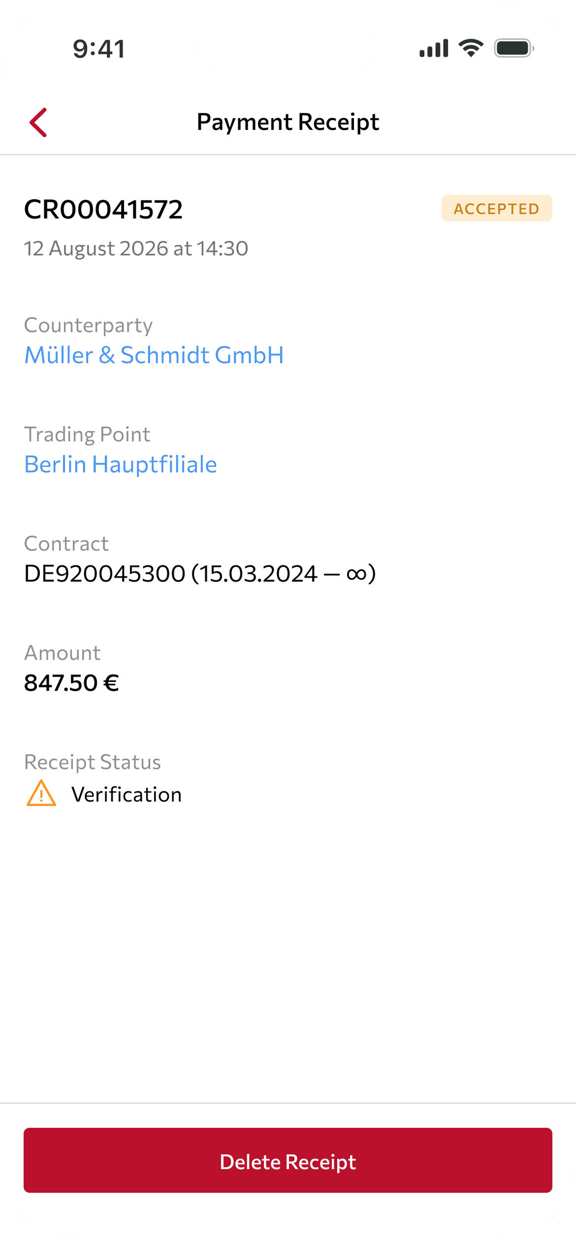
There was no user research here: no interviews, no corridor test. The task was set by law. A cash payment has to be fiscalized through a cash register, or it does not count as received for tax purposes. The logic itself came from the 1C accounting system and the cash register (KKM) parameters. My job was not to invent the model. It was to take an already-defined, legally and technically complex state machine and turn it into something an agent could understand quickly, without being scared by it.
Before

Same status for a payment already accepted and a check still stuck verifying.
After
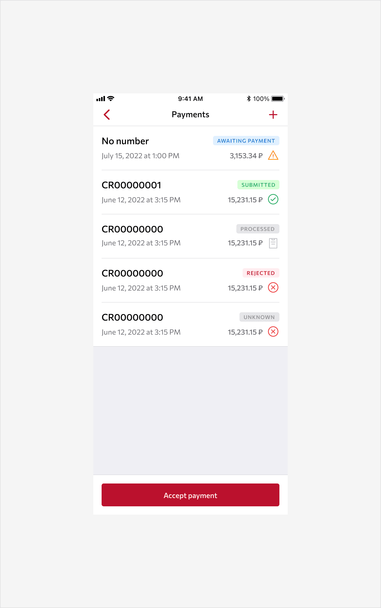
Two signals side by side: a text badge for the payment, an icon for the check.
The payment and its check have separate statuses
The core complexity: a payment and its check carry different statuses, and they do not move together. A payment can already show "Accepted" while its check is still "New," just created, not yet sent to print. Or the payment has been accepted for a while, and the check is stuck in "Check," waiting on confirmation from the register that has not come back yet.
In the payment list, both statuses sit side by side. The payment shows as a text badge ("Awaiting payment," "Submitted," "Processed," "Rejected"). The check shows as a separate icon (yellow triangle for "Checking," green check for "Success," red cross for "Error"). The split is deliberately visual: the agent needs to see these as two different facts, not one status with two names.
Before

"Accepted" tells only half the story.
After

The check's own status, "Verification," sits right below, not combined with the payment badge.
You cannot just delete a payment if its check already went to print
The least obvious decision in the whole feature: what happens when you delete an accepted payment depends on whether a print request for its check has already been sent.
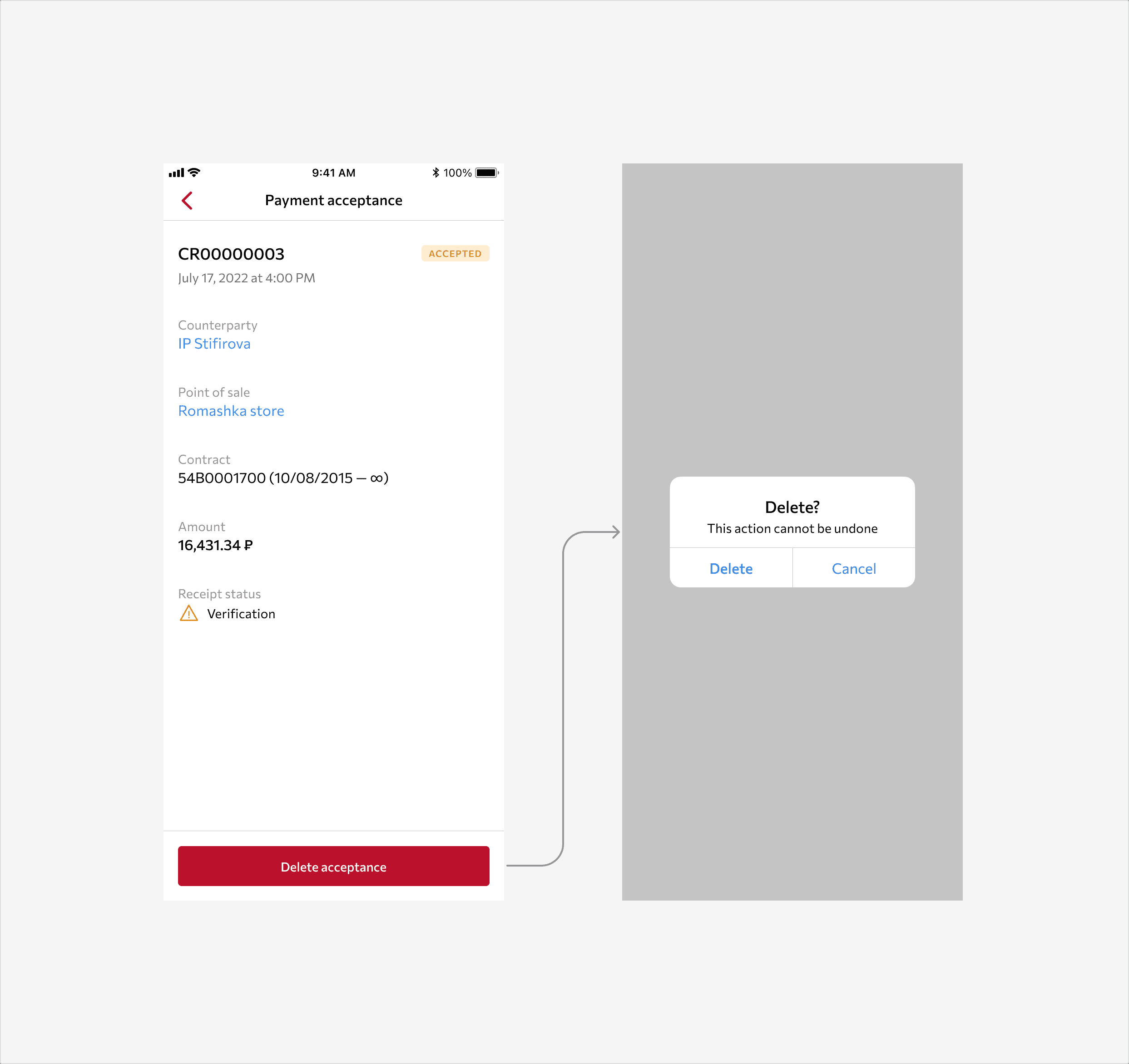
Concept, not shipped. A generic confirm/cancel does not account for whether the check already printed.
If the check has not been sent to print yet, deletion works like a normal delete. The payment just disappears. Nothing legally significant has happened.
But once the print request has gone out, the system cannot delete it directly. A physically printed, or already queued, fiscal document is a legal fact that cannot be erased after the fact. Instead of deleting, the system creates a reversal entry, a negative-amount storno with its own refund check, which goes through the full fiscalization cycle too. The agent sees one action, the "Delete" button, but two completely different outcomes happen behind it, depending on a check state they never see. The design task was making sure that difference did not turn into confusion for the agent. The agent just taps delete, and the system picks the right path.

Same button, different outcome. The system already knows whether the check went to print.
You can only hand in cash if every check is clean, and that is enforced, not just suggested
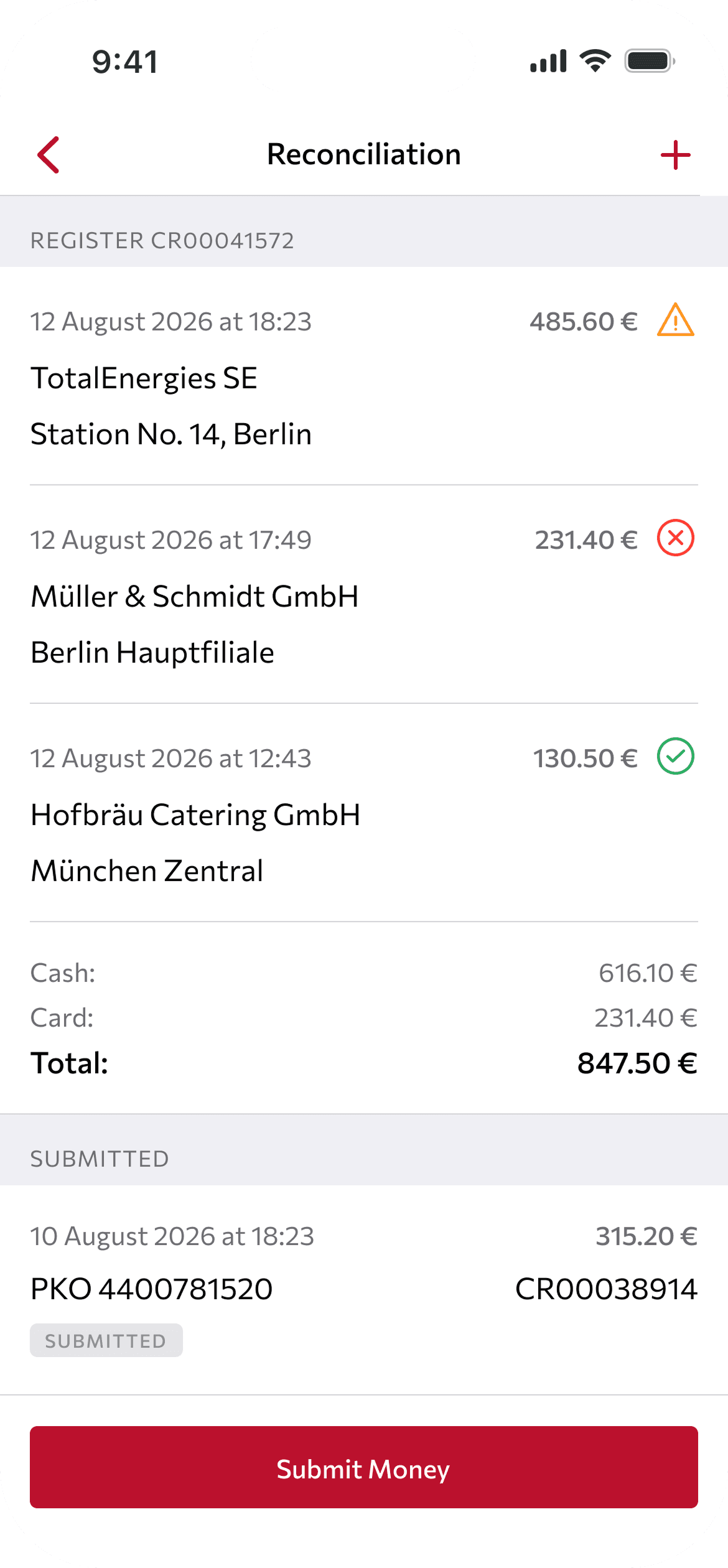
The Incassation screen carries the key constraint: an agent cannot submit cash to the bank or warehouse office if even one check in the open register is anything other than "Success." This is not a soft recommendation. The "Submit cash" button either works, or it shows a blocking dialog.
Two different messages for two different situations, because they call for different actions: If any check is in "Error": "Some checks couldn't be processed. Please contact support." The agent cannot fix this alone. It needs help from another team.
If checks are simply unconfirmed yet (still checking, not an error): "Some checks aren't ready yet. Please wait." This is not a problem, just a matter of time. No need to contact anyone, just wait for the next status check.
Separating these two messages was a deliberate choice. The same wording for "wait" and "you need help" would send the agent to support even in cases that just needed a minute.

One button, two very different reasons it will not work.
Automation works fine when there is signal. Remote regions needed a manual way out.
The system is built so fiscalization happens automatically. A cron job checks statuses every minute and updates them without the agent doing anything. By design, the manual refresh button was only meant for testing, and it was supposed to disappear before release.
In practice, for agents in remote regions with unstable internet, a check could stay stuck in "Checking" for a long time, and the automatic cycle did not help. If the agent's device has no signal exactly when they want to close their shift and hand in cash, waiting for the next automatic pass meant wasting time for no reason. The manual refresh button, originally meant only for debugging, stayed in production specifically for this group. An agent in a low-signal area can force a status check themselves instead of waiting on the automation.
This decision came from actual usage, not from the design phase. The team assumed automation would be enough. This assumption did not consider agents in areas with slow connections.
Working with the team
Same team setup as the other KDV cases: analysts shaped the requirements and status model together with the 1C integration and the cash register web service. Several development teams covered front and back end in parallel. My role as product designer was not about user research here. It was turning an already-finished legal and technical model into an interface where the agent never has to read 1C error codes (ErrorLevel 101, 102, 107, and so on), only clear states and clear next steps.
Summary
The feature is in production. There are no conversion metrics here, and there cannot be. This is not a hypothesis, it is a legal requirement to be enforced. The indirect measure of success: agents close their shift without needing a manual support call in most cases, and where automation is not fast enough because of connectivity, they have a clear manual option instead of being stuck.
The case is really about something else: how a legally and technically unavoidable complexity, a check that lives apart from its payment, printing that cannot be undone, 1C statuses that mean nothing to an agent, turns into an interface where the user sees not the system, but a clear set of states and three possible actions: accept, delete, submit. The solution found here, leaving a manual path where automation does not work well enough, later became a general rule for other background processes in the product.