Unlocking checkout for every buyer type
KDV Group
|
B2B
|
Senior Product Designer
|
Payments
|
Self-service
The Trade Agent Personal Account runs across 9 countries, each with its own local payment integration. This case covers the platform's largest market, where the IPS checkout flow launched.


Results
About 250 orders a day through the IPS channel within the first quarter, up from zero before launch.
Shipped a payment flow with 3 clearly different outcome states, instead of one generic error.
Multi-order checkout now pays each shipment separately, without losing progress if one fails.
My role
Designed the full IPS checkout flow, including multi-order sequencing, QR re-entry, and three distinct failure states.
Wrote the copy and defined the visual tone for payment success, cancellation, and network-failure screens.
A buyer with no way to pay
Owners of street-food stalls, like shawarma and fast food stands, buy mayonnaise in 10-liter containers directly from the supplier. In the accounting system, they are registered as individuals, not legal entities. They have no business bank account and no way to pay on credit terms.
These buyers simply could not pay for an order through the app before. Standard invoice payment did not work for them, and IPS was not available for legal-entity accounts. In practice, this meant one of two things. Either the agent did not sell to this location through the app at all, or the payment happened in cash, with no record in the system.
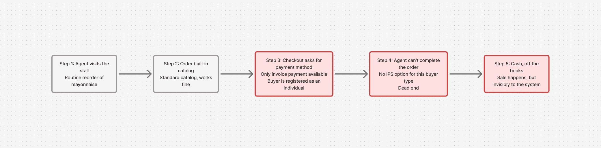
CJM: the buyer's journey before IPS existed for this segment.
The task was not to add another payment method. It was to open a sales channel that did not exist for this segment at all.
What the flow looks like when everything goes right
The agent logs in under the location, builds a cart from the standard catalog, and places the order. The only difference is that the payment method is fixed as "Instant Payment System," with no choice to make. After placing the order, a screen appears with a QR code and a timer. The buyer scans it and pays.

The full path on one diagram: checkout, QR with timer, and one of three final screens. Localized for portfolio purposes.
A single "Error" screen did not work
The first version took the simplest path. If payment failed, for any reason, it showed "Payment failed."

One message, three different causes. Localized for portfolio purposes.
The problem surfaced during a pre-release walkthrough, when I ran through the flow myself, testing failure scenarios. I let the timer expire on purpose, and I cut the connection while waiting for a response from the payment gateway. By the third run, it was clear: the same screen was saying the same thing in three situations that are completely different for the agent.
The agent is standing next to the buyer and has to explain what happened. If the timer expired, they just place the order again, and nobody is at fault. If there is no connection, they check the network, and it is not the buyer's or their bank's problem. If the payment succeeded, that is not a failure at all, and a warning screen would send the wrong message. A single "failed" screen left the agent guessing and forced them to explain something unclear to the buyer.
Success - "Payment successful."
Timer expired - "We'll update the order status shortly."
No connection - "Check your internet connection."
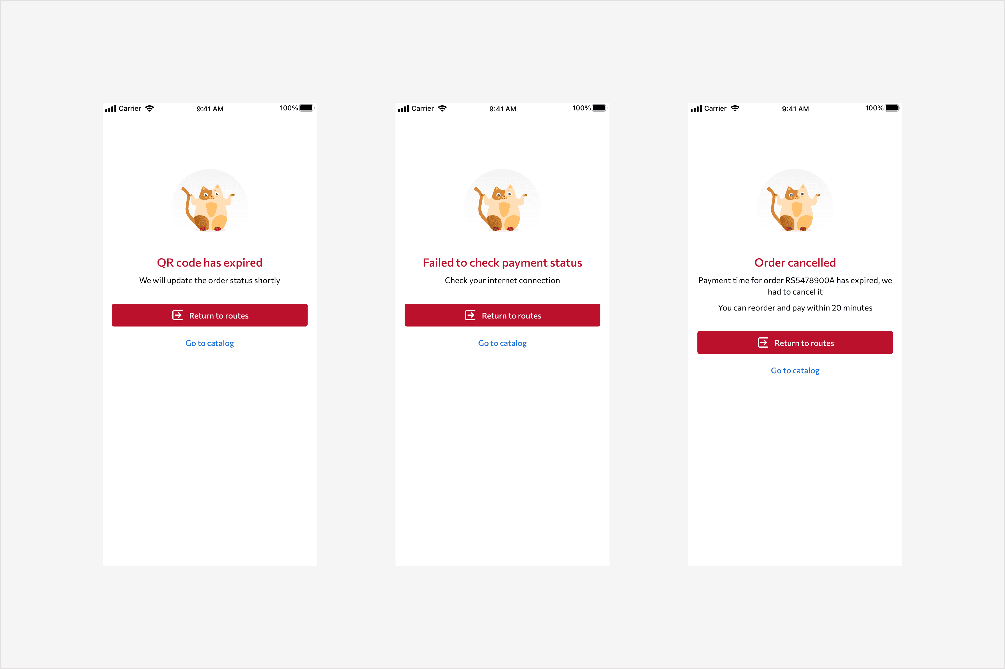
The three final states, up close. Localized for portfolio purposes.
One QR code for the whole multi-order seemed like the obvious fix
Wireframe: "Single QR for the full amount" (concept, not shipped). We rejected this. The payment gateway generates a QR code tied to a single order's amount, not a group of orders. Building a "group payment" entity was out of scope for this task.

Sequential payment of two shipments, with independent failure handling for each. Localized for portfolio purposes.
We went with sequential payment instead: one QR code after another. A failed payment on one shipment does not roll back one that already succeeded. The screen shows "Shipment 1 of 2 paid" and moves the agent straight to paying the second one separately.
Close the QR screen: does the order get cancelled?
We discussed a strict rule: if the agent closes the QR modal without waiting for payment, the order auto-cancels, and the agent starts over. The logic seemed reasonable at first. We did not want unfinished payments to sit around indefinitely.
Wireframe: "Auto-cancel on close" (concept, not shipped).
We rejected it, because an agent does not only close the screen when they have changed their mind. They get distracted, answer a call, or the buyer needs a minute to find their phone and remember their banking app password. A hard cancellation would have punished the agent for a normal work pause, not an actual decision to skip payment.
Instead, we allowed re-entry. The agent goes back to the order from the general list, and the modal shows the current status: still waiting, with time left; already paid; or cancelled, if the timer ran out. We also handled the case where the response had not come back yet, with an honest "Status will update shortly" instead of leaving the screen stuck with no answer.

Entering the order from the list, reopening the QR modal with the current status. Localized for portfolio purposes.
Four edge cases checked before handoff to development
If an agent and a substitute agent open the same order at once, whoever opens it second sees the current status, instead of a second QR code being generated.
Double-tapping "Pay" is blocked until the backend responds.
If the connection drops while the QR is being generated, a timeout leads to the same "couldn't verify status" screen used for a later connection failure.
If a buyer scans an already-cancelled QR, the gateway correctly rejects a payment against a code whose order has already been cancelled.
Working with the team
Analysts defined the status model and the payment gateway integration. Developers covered the front end across platforms. The product owner made the final call on all three decisions above, based on what I brought to the table. I came in with options and an argument for why the simple version would not work, and what to do instead.
Summary
Each decision started with a simpler version that did not hold up in practice: a single error screen, a single QR code, auto-cancellation. The job was not to invent one universal answer. It was to try the simple version at each point, see where it broke, and add just enough complexity to fix it.
This is a narrow segment, and we did not run user interviews. Decisions were validated by walking through scenarios before release, not through contact with real buyers in the field. This is not a story about a growth metric. It is a story about opening a sales channel for a segment nobody had actually talked to before.