KoronaPay - money transfers & digital wallet
Product Designer
My role
Designed the digital wallet and KoronaCard experience from scratch, covering 50+ end-to-end scenarios.
Rebuilt and scaled the cross-platform design system using Auto Layout. Introduced a cross-platform design review process between design and engineering.
Results
Reduced drop-offs by 24% by redesigning the payment confirmation screen. Increased SMS opt-in from 20% to 22.8% through an A/B test, driving a 14% revenue lift.
Cut visual inconsistencies in production through a new design review process. Launched the wallet as the app's main financial hub for transfers, balance, and credit.
KoronaPay is a fintech application that lets users send and receive international money transfers and access lending services. Most users rely on the app to send money to family members in other countries.
Before the wallet was introduced, money management inside the app was fragmented. Users could send or receive transfers, but there was no clear place to store money, manage balances, or use financial services in one interface.
The goal of the project was to create a digital wallet and payment card that would become the financial center of the app. Users would be able to store, manage, and use their money directly inside KoronaPay.
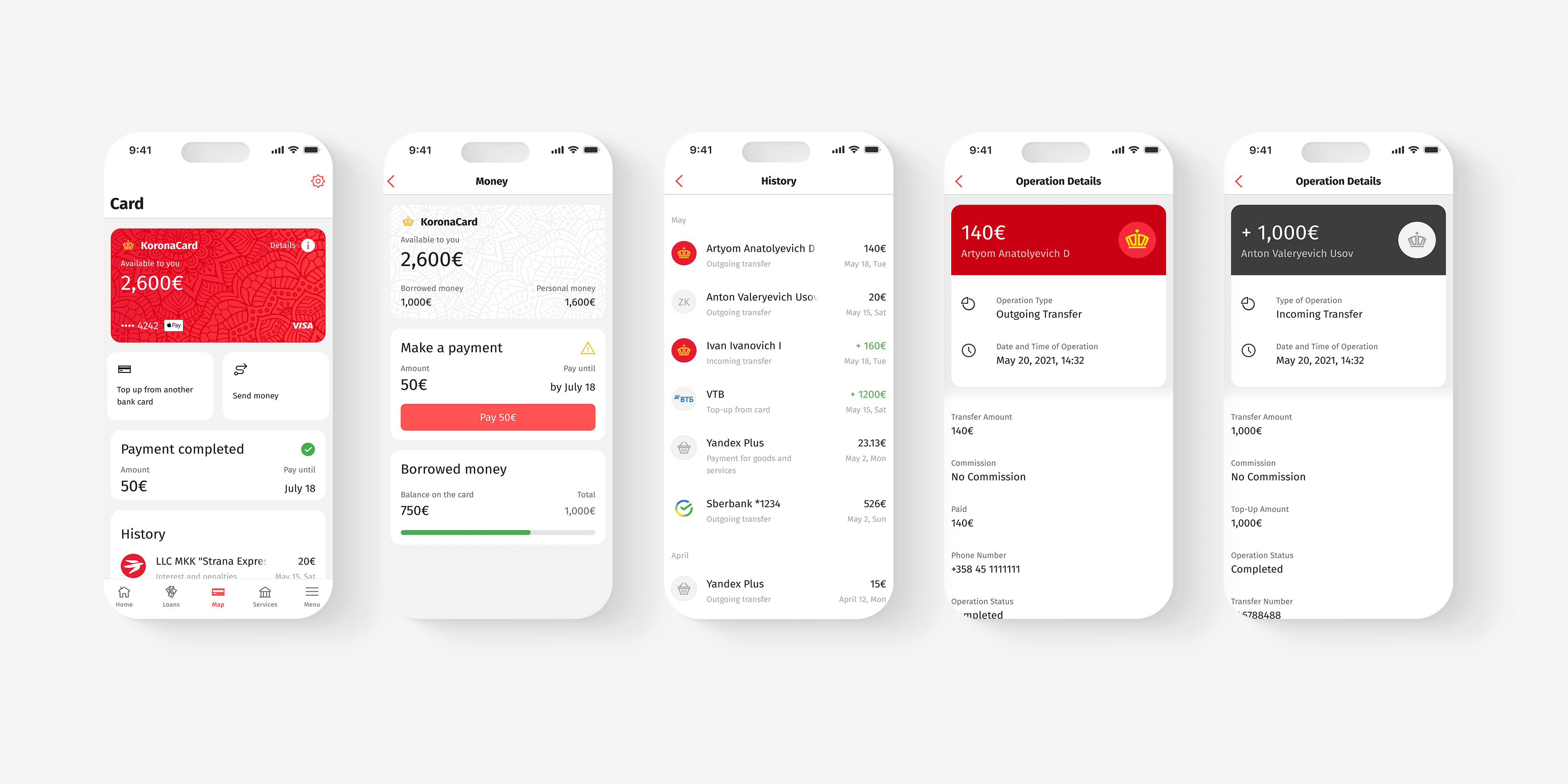

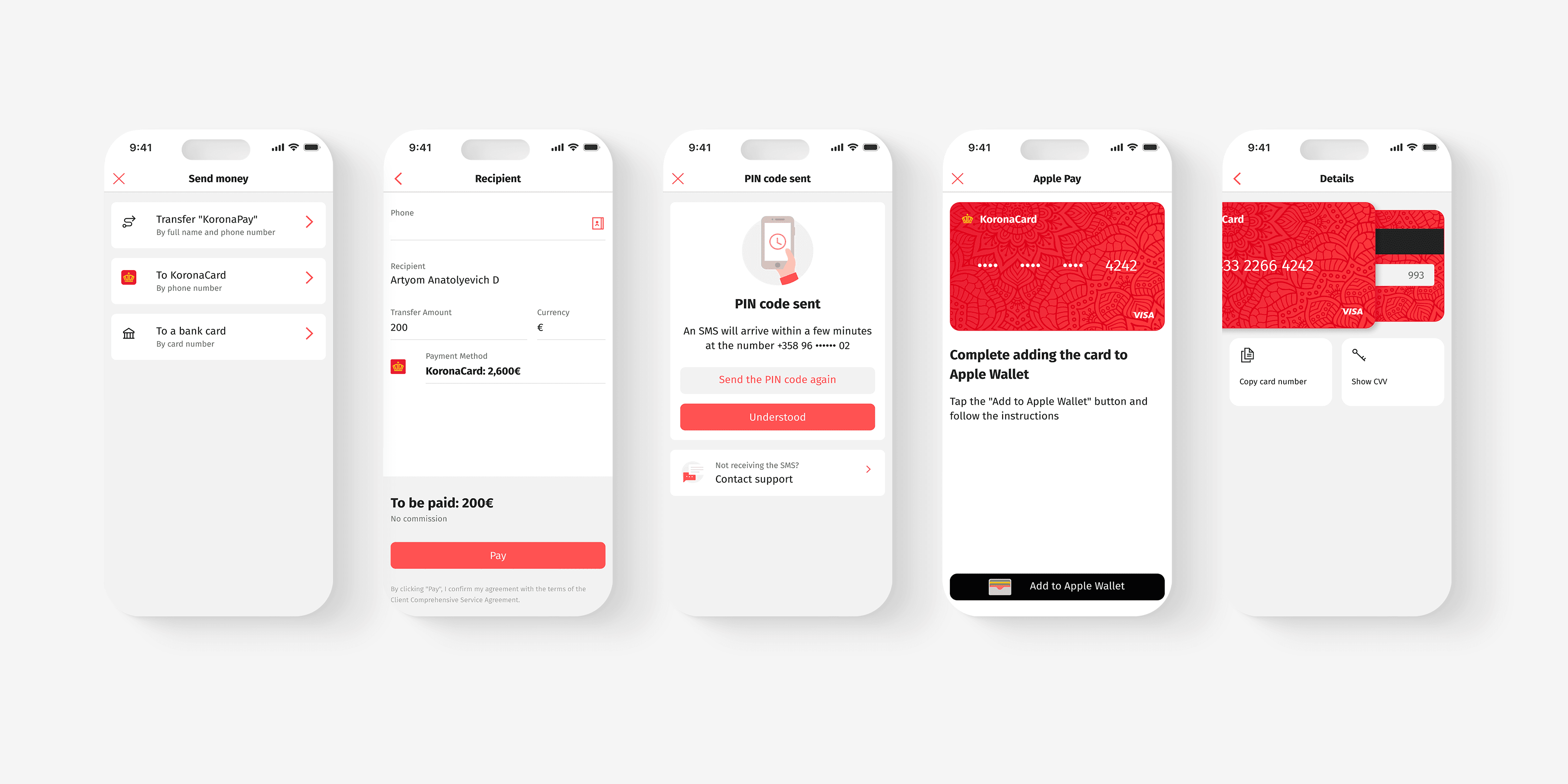
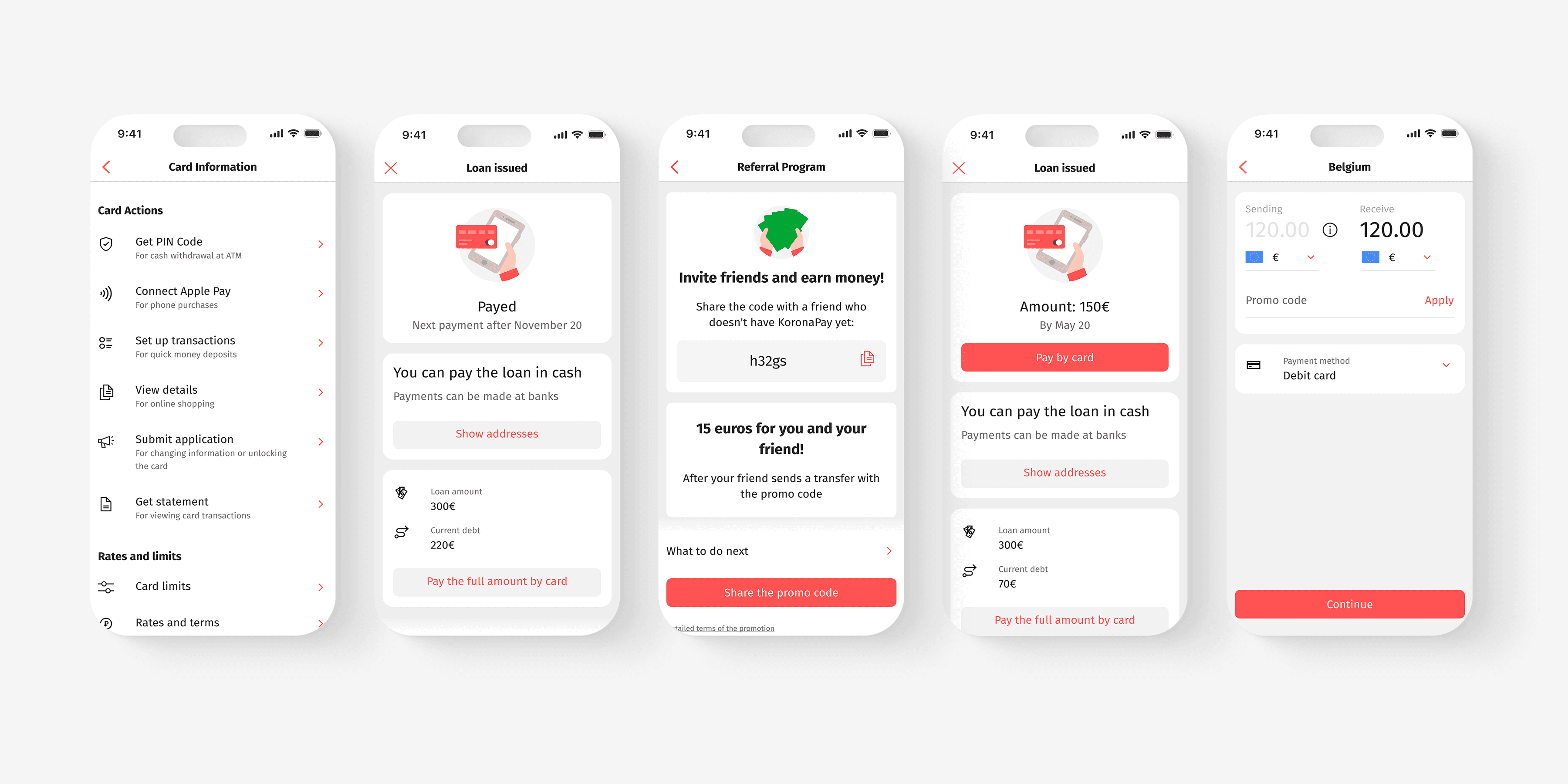
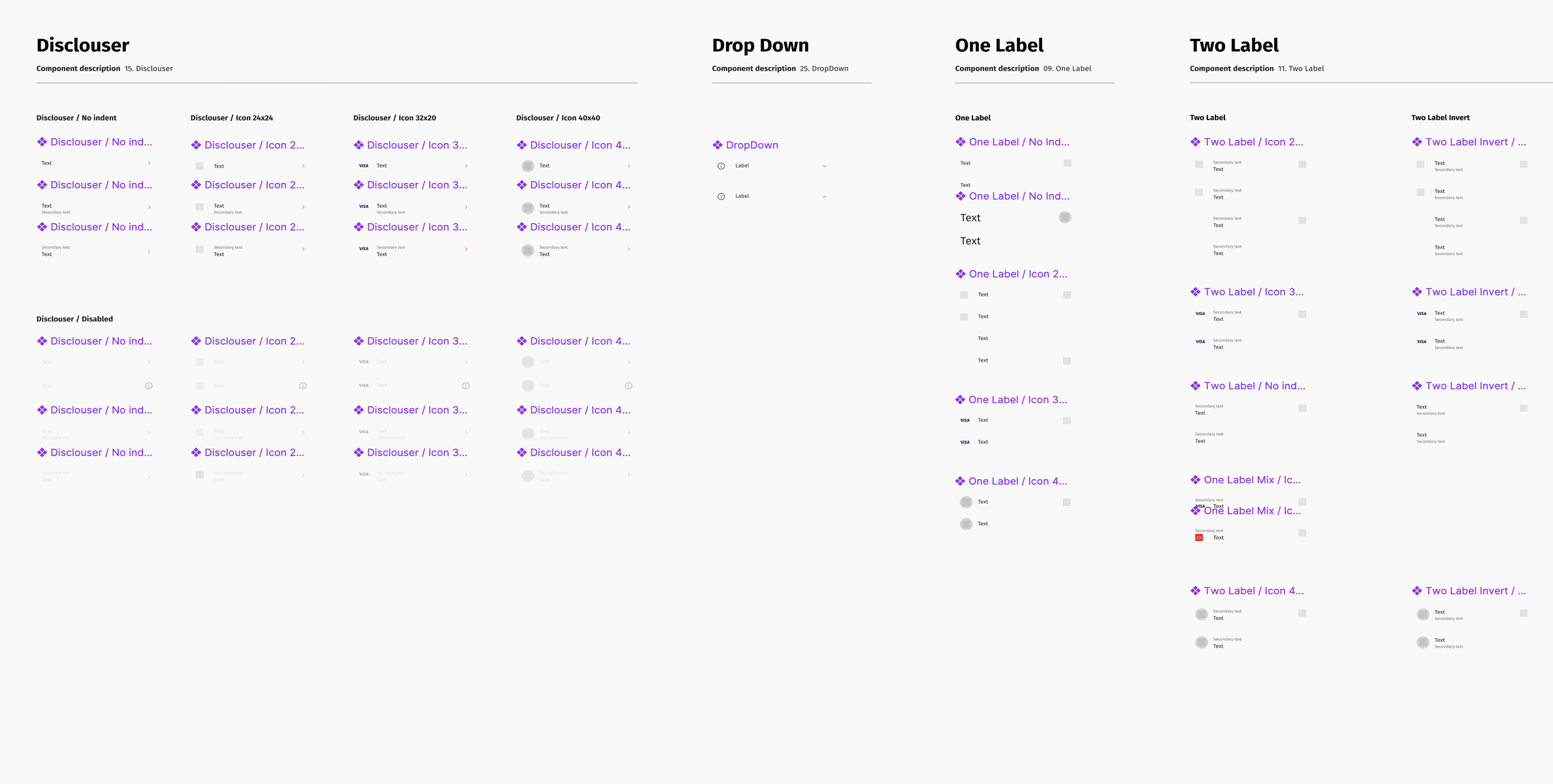
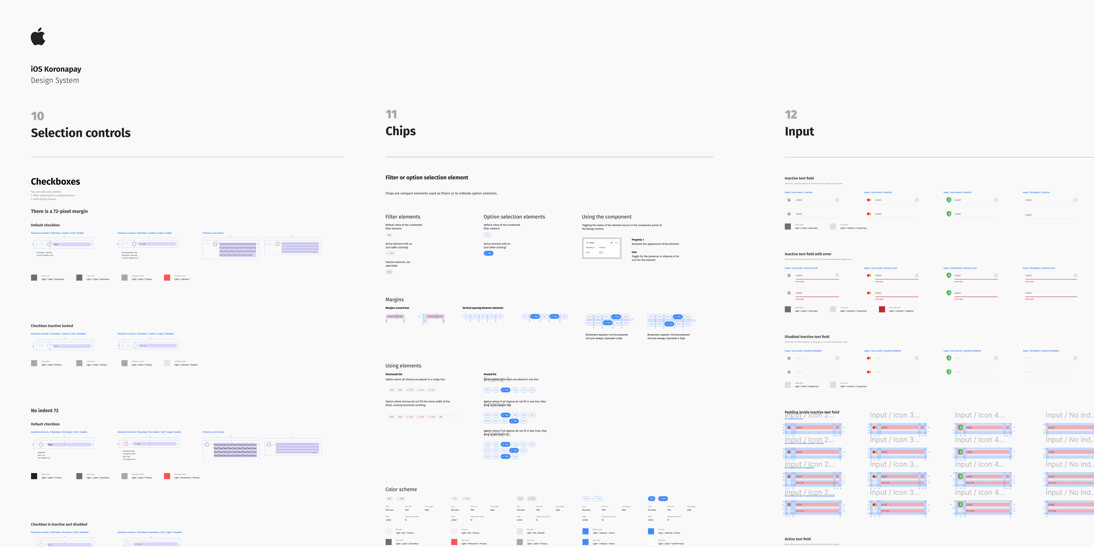
When I joined the product, one of the first challenges was the unstable state of the design system. Components behaved differently on iOS and Android, some elements were missing, and the existing library was hard to scale.
Before designing the wallet itself, I focused on stabilizing the foundation of the interface. I audited existing screens, user flows, and UI components in both mobile apps.
Based on this audit, I rebuilt the component library using Auto Layout and component variants to make the system more flexible. This restored missing elements, aligned component behavior across platforms, and gave the team a documented system to rely on. New features could now be built faster while keeping visual consistency across the product.
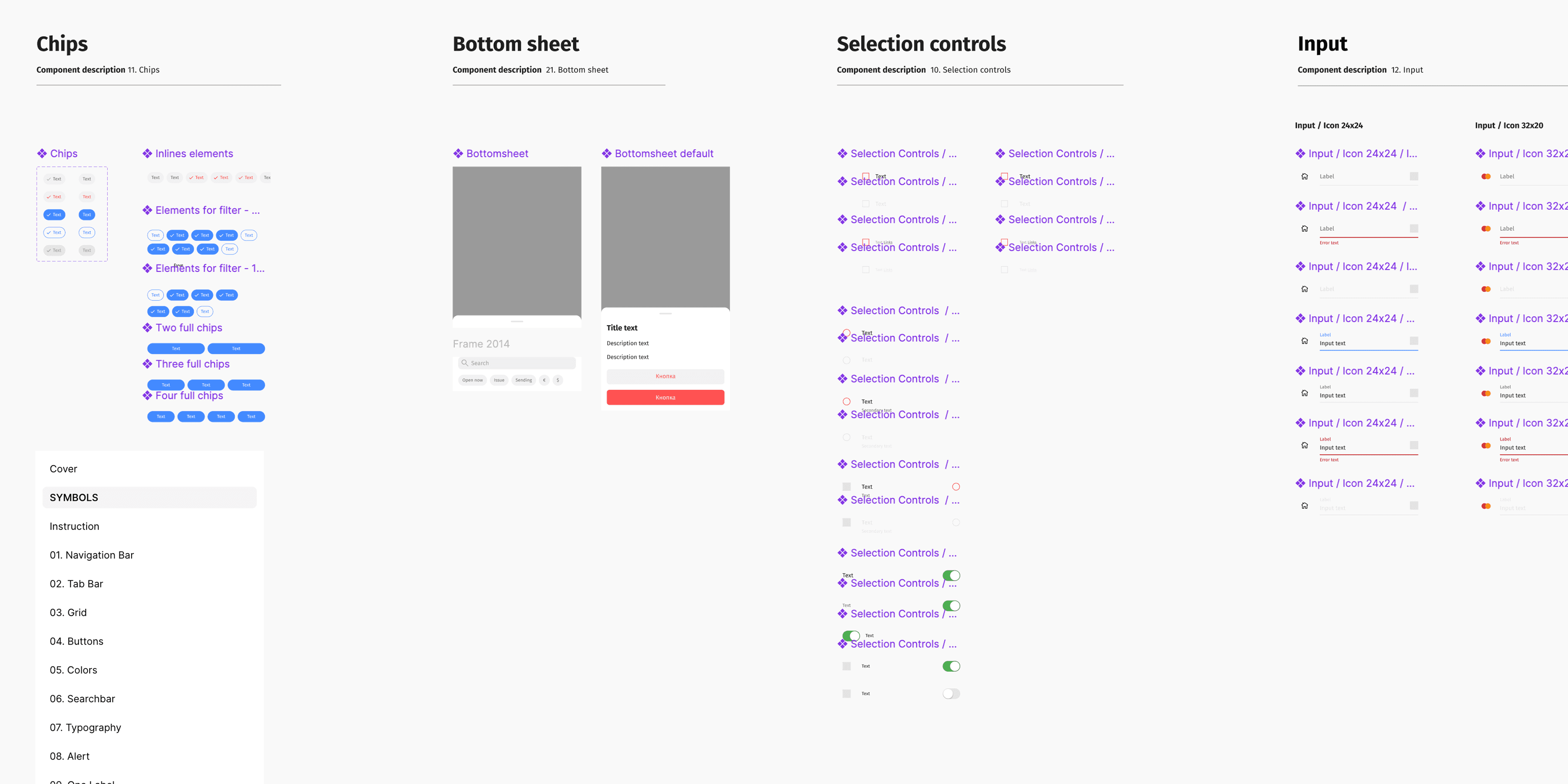
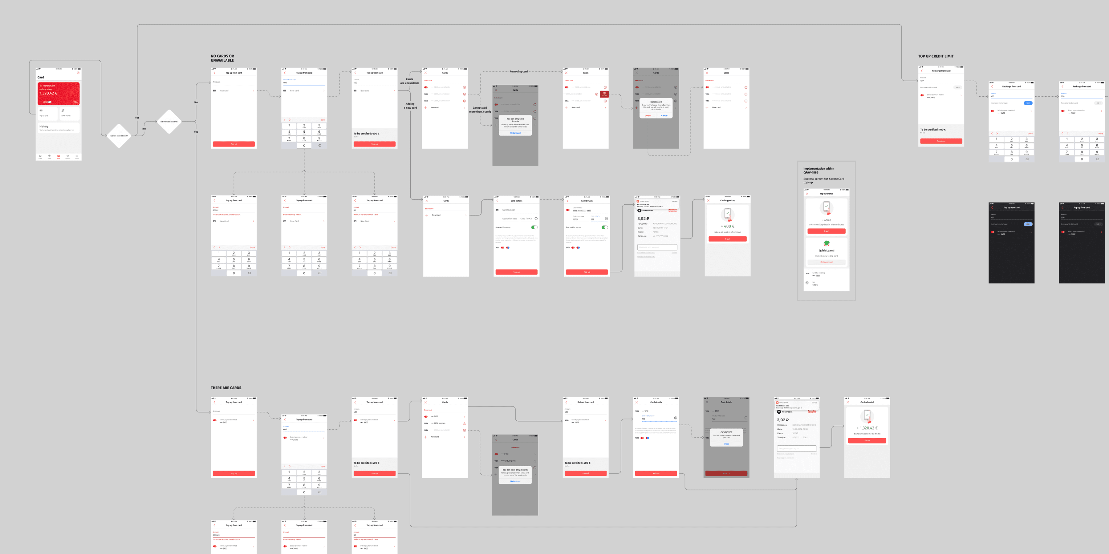
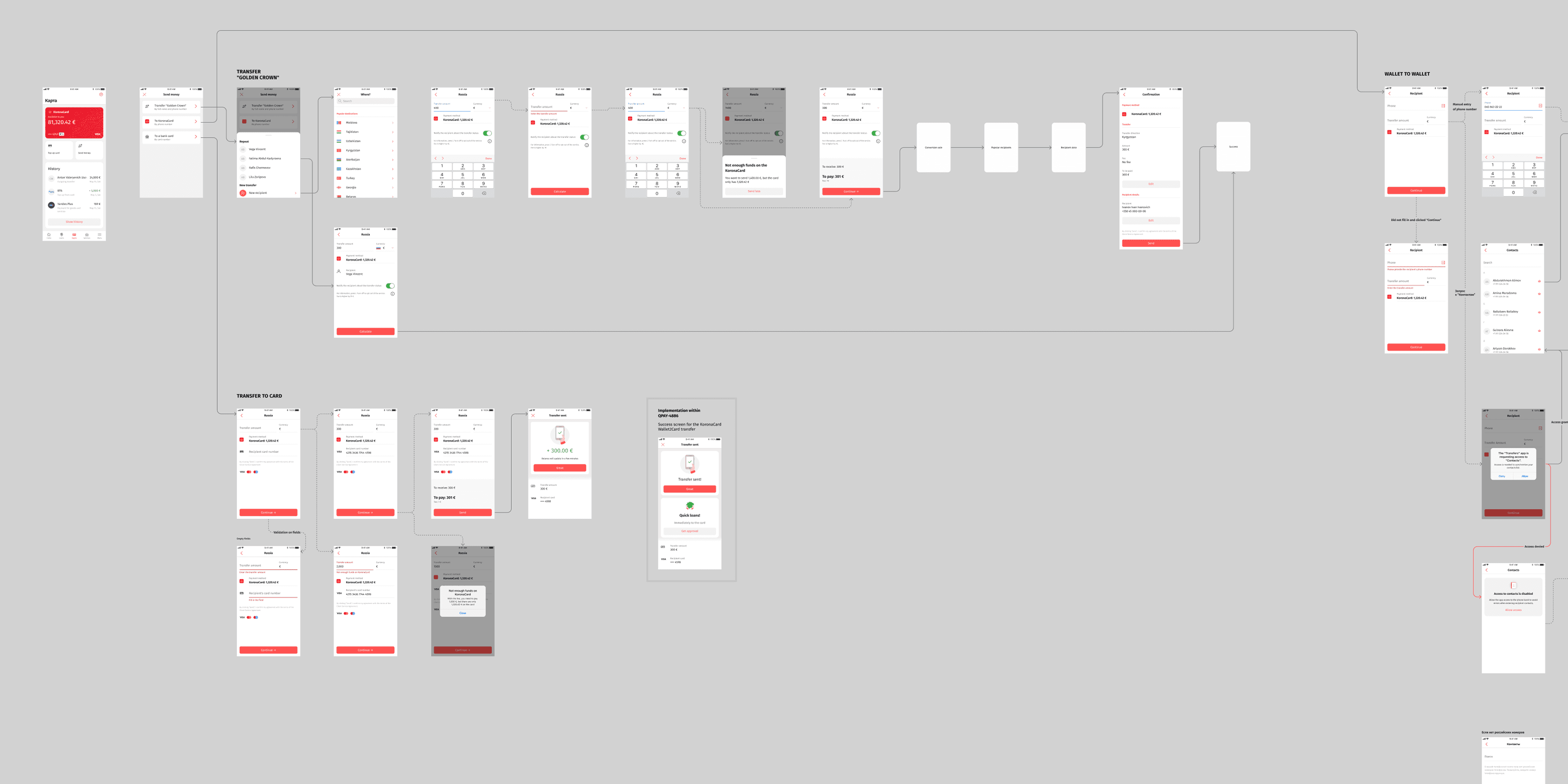
Once the design foundation was stable, the team moved on to the first version of the wallet. Working with product managers and analysts, we looked at product data and user scenarios to decide which financial flows mattered most for the MVP.
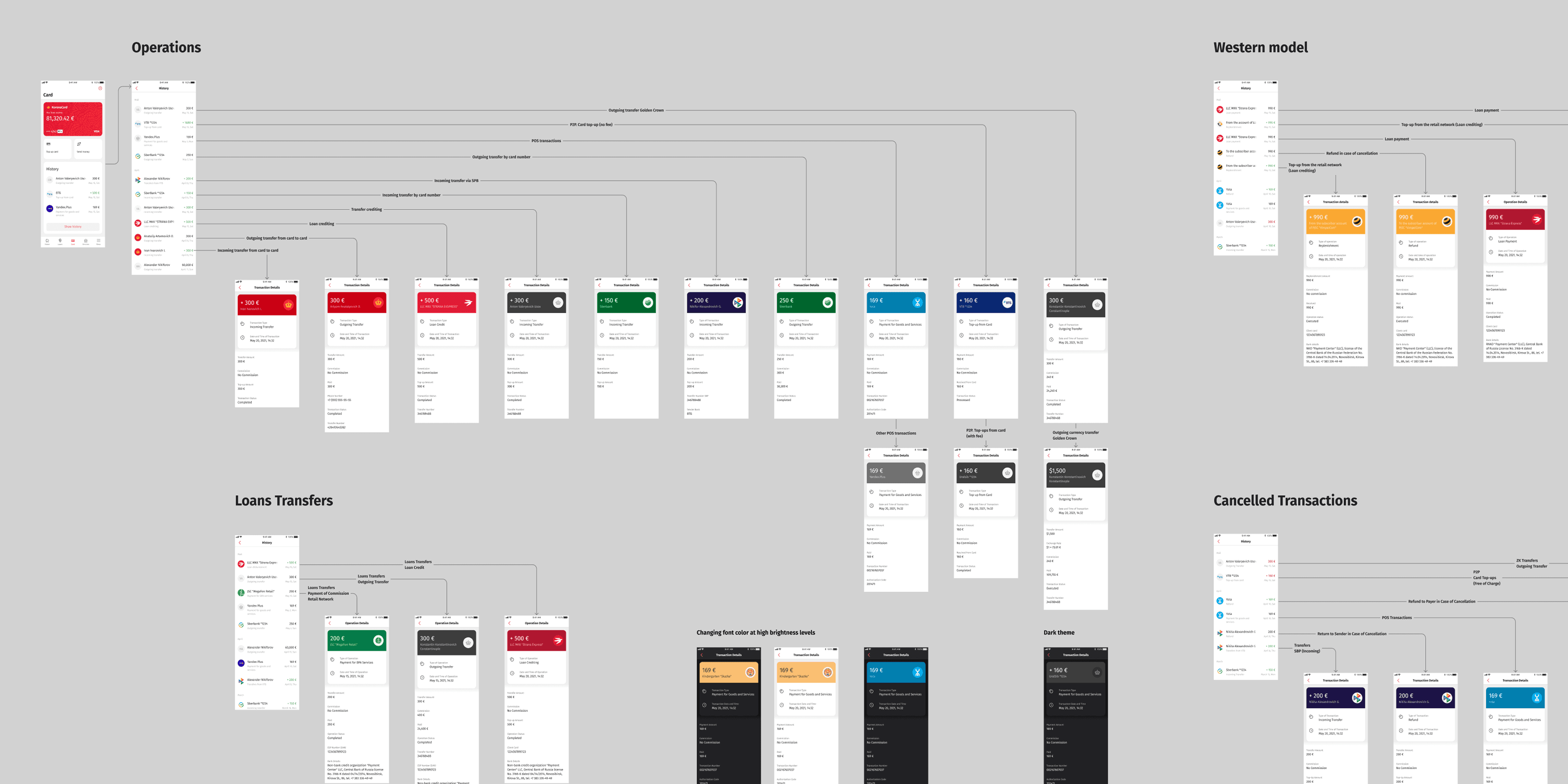
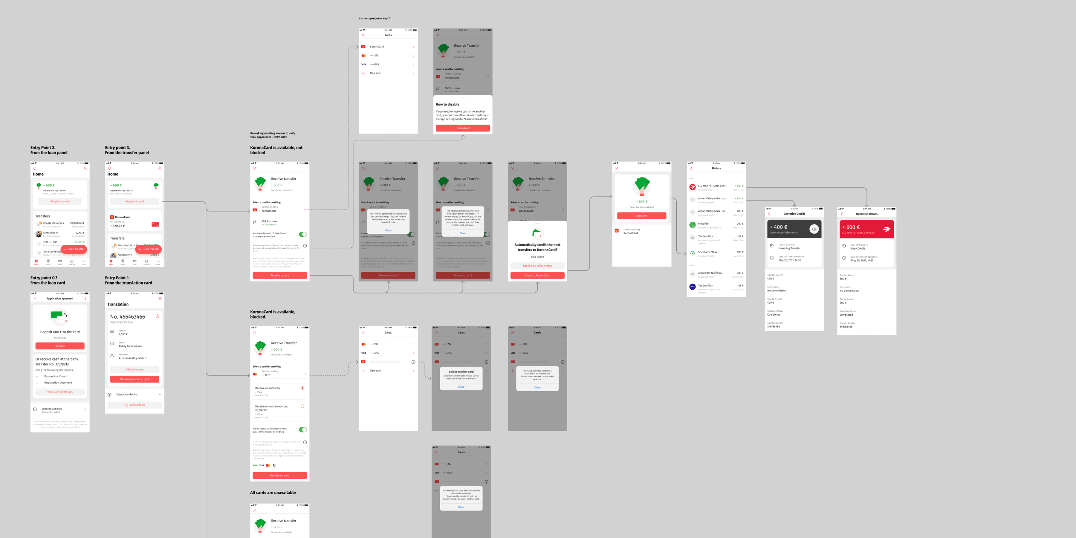
The wallet architecture focused on the core financial actions in the app. Users needed a clear way to receive transfers and loan funds, send money between wallets, and track their financial activity.
I designed the wallet interface to make these flows simple and clear. Instead of spreading financial features across the app, the wallet became one place where users could see their balance, track transactions, and manage money.
After the MVP launch, the wallet kept evolving. We added virtual card integration with Apple Pay and Google Pay, transfers to external bank cards, transfers from the card itself, service requests, and transaction limits.
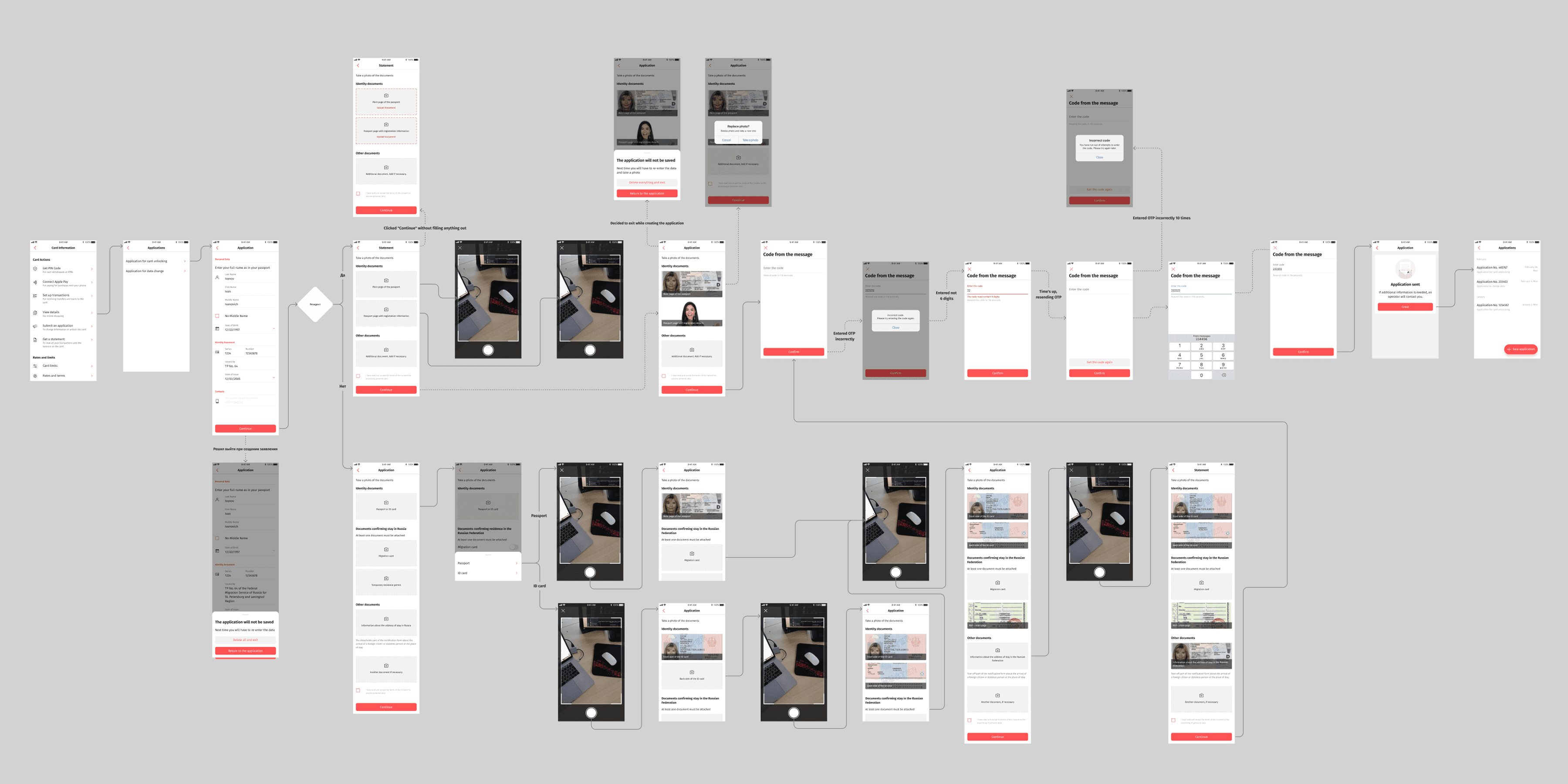
Later, I designed the credit limit experience. This meant building a full user flow that included KYC verification, credit activation, and repayment options. Users could clearly see their credit availability and choose between minimum payments or full repayment.
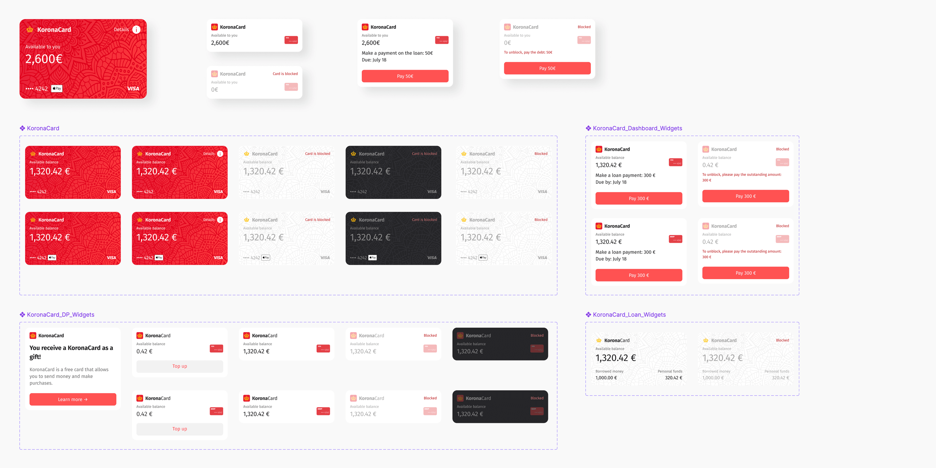
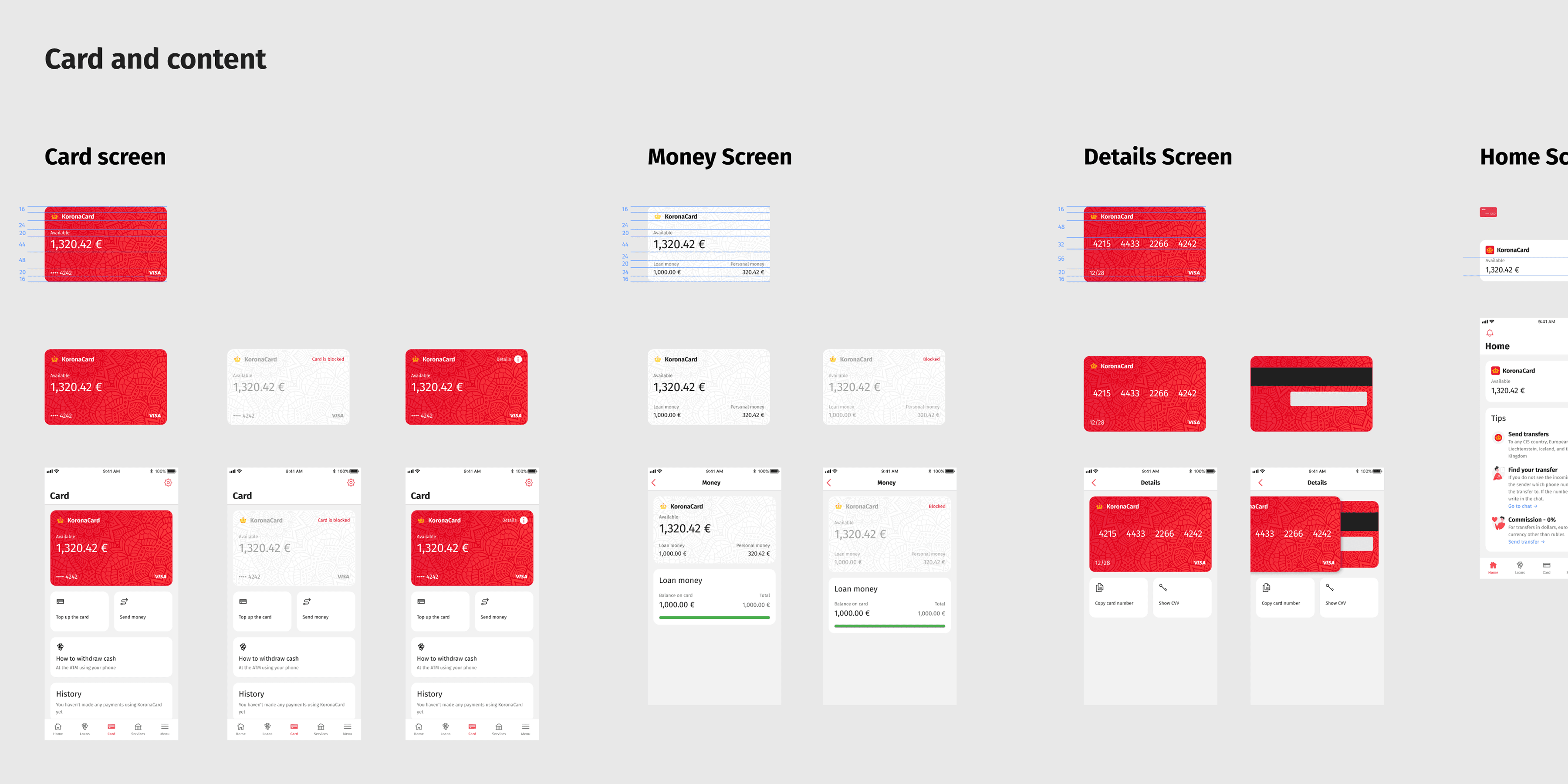
Another part of the project was designing KoronaCard, the payment card connected to the wallet. I designed both sides of the physical card and made sure the visual identity worked across physical and digital formats. I adapted the same design for digital use inside Apple Pay and Google Pay.
To make the wallet easier to read, I also designed a set of card widgets. These widgets let users quickly check their card balance, card status, and any credit or loan debt. This made the wallet easier to trust and manage.
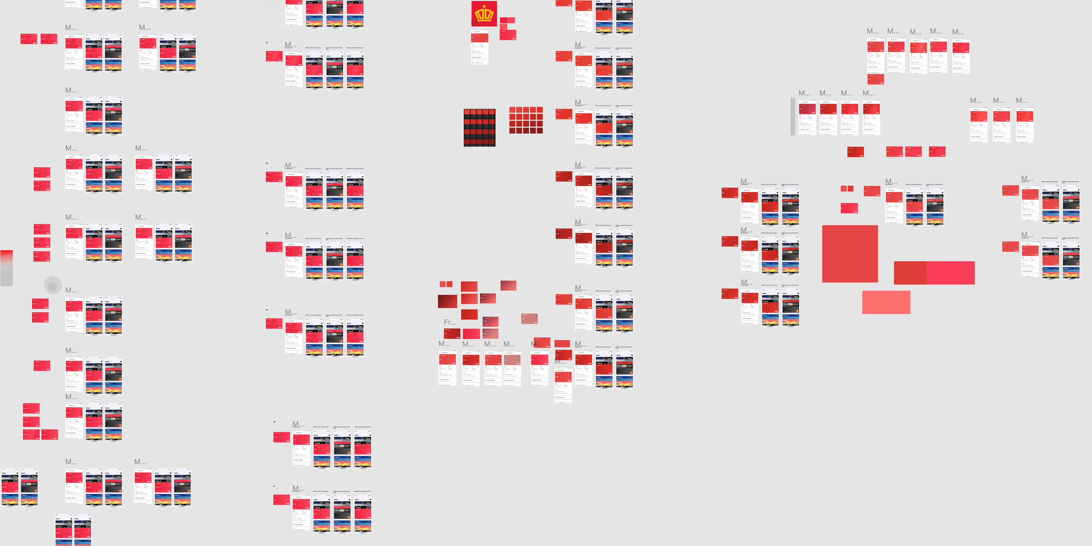
Beyond the wallet itself, I helped improve overall product quality and team process. I supported other teams working on related features, like transfers and loans, with UX and visual input. I also ran competitor analysis to find new opportunities for the product.
During development, I noticed repeated visual inconsistencies across screens. I started a backlog for UI issues and design inaccuracies, so the team could fix visual problems systematically over time.
Later, I introduced a cross-platform design review process to make sure implemented features matched the design. This improved collaboration between design and engineering and cut visual inconsistencies in production.
I worked closely with product managers, analysts, and engineers throughout the project. This close collaboration helped the team stay productive and deliver good results.
The wallet became KoronaPay's main financial hub. Users came back to it for different tasks: receiving transfers from relatives, getting loan funds on their card, checking balances, and managing transactions.
KoronaCard and the credit limit expanded what the wallet could do. Users could store money in the app, pay with the card, and manage credit through clear repayment flows. By bringing transfers, card usage, and lending into one interface, the wallet turned KoronaPay from a transfer service into a more complete financial platform.