Telling users a payment worked, right away
KoronaPay
|
Fintech
|
Product Designer
|
Support reduction
KoronaPay is an international money transfer service in 50+ countries. Inside the app, a digital wallet and credit-limit card (KoronaCard) serve tens of thousands of active cardholders.


Results
Cut drop-off by 24% (tracked over the following quarter).
Support tickets on this topic dropped to zero after launch. Only genuine payment failures remain.
What I owned
Designed the debt repayment flow across two entry points
Ran interviews with users and internal stakeholders to define the processing-state UX
Walked the full user journey solo across all three teams' work to catch cross-screen mismatches
The user paid, but saw no result for 24 hours
The problem came from two sides at the same time: support kept getting the same complaints, and the analysts flagged the same issue in their requirements. The user paid off their credit limit debt, but nothing changed in the transaction history. Not the interest, not the late fee, not even the payment itself. Full repayment needed up to 24 hours to sync with the acquiring system. During that time, the user still saw the old debt widget, as if the payment never went through.
For someone who just sent money, this looked like a failed payment, not a technical delay.


Payment confirmed by the bank. Nothing changed on screen.
Interviews from both sides: users and support
I ran 8 interviews: 5 with KoronaCard users and 3 with support staff.
I didn't pick users randomly. I went through support chat logs and found people who had already written messages like "I don't see any change after paying" in the past few weeks. This gave me access to people who actually hit the problem, instead of guessing based on the general cardholder audience. The format was a free conversation based on a guide, not a strict script. I wanted to hear how people described what happened in their own words, not confirm an idea I already had.
For support, I picked people with different roles and experience: a chat operator, a senior specialist, and a team lead. This helped me see both the front line (what people write in the moment) and the bigger picture (how often it happens, the pattern, the load on the team).

8 interviews, one shared finding: silence after payment reads as failure.
Users described the problem simply: "I paid, and the app shows the same thing. Does that mean the money is gone?" Nobody knew about the 24-hour delay, because nothing in the app explained it. Silence was read as a failure, not as a process.
Support confirmed it: this topic was one of the most common reasons people wrote in, especially in the first few hours after payment. Users weren't complaining about fees or loan terms. They were anxious because there was no feedback.
This narrowed the task. We didn't need to make the sync with the acquiring system faster. We needed to close the gap in how the wait felt.
Two entry points, one flow
Paying off credit limit debt starts from two different places, but both lead to the same payment process.
First entry: from the home screen, where a widget shows the minimum payment or full debt amount, with a "Pay" button.


Payment is due but nothing is blocked yet. The widget follows the user from Home to Card to Money, always showing the same amount and deadline.
Second entry: when the credit limit is already blocked due to a missed payment. Instead of a balance, the card shows a "Blocked" status, all actions are disabled, and the only option is to pay off the debt to unblock the limit.


The card itself goes grey and inactive across all three screens. The visual state matches the functional one. "Pay" is no longer optional. It's the only way back into the account.
Both entries lead to the same payment process, but the card's state tells the user something different each time. In the first case: "you still have time, here's what's due." In the second: "access is closed, paying is the only way forward."
We replaced the debt widget with a processing status
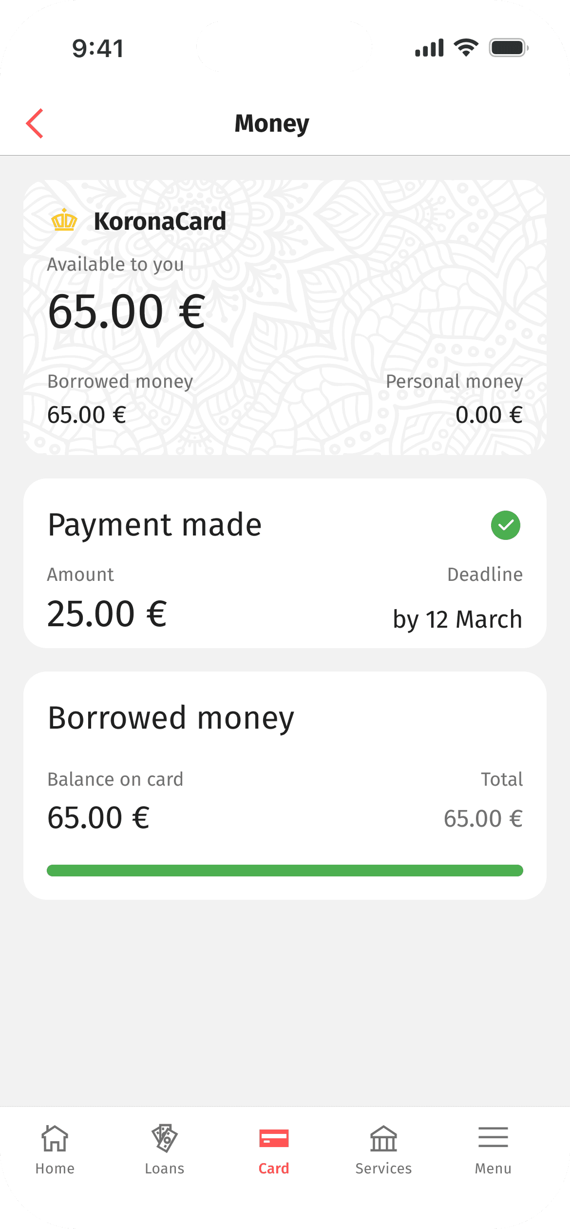
The key decision was this: after a full payment, the old debt widget doesn't stay on screen in its old form. Instead, there's a confirmation screen: "Payment made," a checkmark icon, and the line "Your balance will update in a few minutes." The user clearly sees that the system recorded the payment, even if the real numbers in the history update a bit later.

Confirmation is instant. The debt widget's old spot now shows the payment fact, not a waiting screen.
This separated two things that used to blur into one: the payment went through, and the data is synced. The first happens instantly and should be visible right away. The second can take time, and that's fine, as long as we tell the user clearly.
After confirmation, the home screen card updates too. The available limit goes back to full, and the "Blocked" status is removed where it applies.
Before choosing the status card, I looked at 5 concepts
I considered five different formats for payment confirmation. Each solved the problem in its own way, and each had a cost.
A toast disappears in a few seconds, while the old debt widget with outdated numbers stays on screen. A full-screen modal is too heavy a gesture for a routine action: it blocks the whole screen and needs an extra tap to close. A "processing" widget is technically honest, but leaves the user in limbo exactly when they need reassurance. A small badge is too quiet. In interviews, users already tended to miss the status, and a badge would only make that worse.


None of these options confirm the payment instantly, in the place the user already looks. So the search continued.
I chose a status card in the same spot as the old widget. It takes up the same place in the interface, so the user doesn't have to look for something new. It shows two facts separately: a green "payment made" checkmark instantly, and the familiar "Amount / Due date" fields, with a note that the balance will update soon. Nothing needs to be closed, and a fresh entry in the transaction history right below the card gives a second, independent confirmation without extra screens.
Out of five options, only this one answered the real question. Not "explain the process," but "confirm the fact," while staying in the place the user already knows.
There was a separate, related problem inside the transaction history
While the confirmation screen solved the problem of the payment moment, a second, related problem came up. The KoronaCard transaction history didn't show credit limit payments at all: not the loan payment, not the interest, not the late fee. The user only saw transfers and purchases. Everything related to the credit limit stayed completely invisible, not delayed, just missing.
We added a new transaction type to the history, with the payment system's icon, the amount, and the label "Loan payment" in the general list. In the transaction details, a separate field shows "Transaction type: Interest and late fees," plus the date, time, and status. This gave users something they never had before: the ability to see exactly where the money went when it was deducted, not just "minus this amount," but specifically interest and late fees as their own category.


Operation type: Interest and late fees, shown as its own field, not folded into a generic debit.
Working with three development teams at once
Three analysts and three development teams (three developers each) worked on this feature, along with a product owner and me as the product designer. The task touched several systems at once: the transaction history, the card status on the home screen, and the acquiring system integration. Each team owned a different layer, working from their own part of the requirements.
Once all three parts were ready, I walked through the entire user journey myself, from the blocked limit to the entry in the history, specifically to catch mismatches that don't show up when you only look at one spec in isolation. Each team could perfectly deliver their own requirement, and there could still be a contradiction between screens that no single team would notice.
That's exactly how I found the gap described below.
What we missed at first: the card and the history didn't match
We had already decided what the history entry would show: the transaction type, the fields, the labels (see above). But we hadn't thought through when it would actually appear there.
During development, we found a mismatch. If the user pays off the debt, lands on the confirmation screen, and then immediately opens the transaction history, there might be no new entry yet, because the sync with the acquiring system isn't instant. The screen says "payment made," but the history is still empty. This could look like the exact same contradiction we were trying to remove.
The fix was to clearly separate what each screen is responsible for. The confirmation screen doesn't claim that everything is updated everywhere. It only confirms the fact of the payment. The line "Your balance will update in a few minutes" was written on purpose to cover both the widget and the history, so the user isn't surprised if they check the history right after and don't see a new entry yet.
Summary
The real problem wasn't backend speed. It was the silence in the interface while the user waited. If someone is paying real money, they won't tolerate uncertainty. The screen needs to say what happened, even if it can't say exactly when everything else will update.
The redesigned confirmation flow reduced drop-offs by 24%. After launch, support tickets on this topic dropped to zero. Only real payment failures remained: actual technical issues, not confusion about what happened.
We split the fact of payment and the fact of syncing into two separate messages. The transaction history finally showed a clear trail of where the money goes when interest and late fees are deducted.