KoronaPay is an international money transfer service in 50+ countries. Inside the app, a digital wallet and credit-limit card (KoronaCard) serve tens of thousands of active cardholders.


What I owned
Unlocked the amount field for grace-period repayments and matched the screen to the app's shared payment UI pattern
Designed and read the results of an A/B test on the SMS notification toggle to increase paid opt-ins
Results
Unlocked the repayment amount field with live commission recalculation. Zero drop in repayment completion.
SMS toggle A/B test (2 weeks): paid opt-in rose from 20% to 22.8% (+14% relative), with overall conversion flat. That's roughly +14% revenue from SMS notifications, on about 100K monthly loan payments.
The product was deciding how much the user should pay, not the user
The ticket sounded technical at first: "unlock the amount field during the grace period." But it hid an assumption nobody had questioned. During the interest-free period, the product assumed it was always better for the user to pay everything at once, so choosing an amount felt unnecessary. The logic seemed to make sense. Why pay in parts if there is no interest yet?
But users do not think about interest rates. They think about how much money they have right now. If a paycheck comes in parts, or some of the money is needed for something else, the user cannot pay the full amount. The product gave them no other option besides waiting. We were optimizing for the loan's financial logic, not for how people actually manage money.
Before


The old flow only offered one number: the full amount due, with no way to change it.
Unlocking the field, and matching the rest of the app
We unlocked the read-only "Amount" field for grace-period loans, so users could enter any amount, not just the full debt. At the same time, we reworked the layout to match the shared payment UI pattern already used elsewhere in the app. Amount and commission now recalculate live at the bottom of the same screen, instead of a separate static breakdown. This was not just a fix for grace-period loans. It made the loan repayment screen match how amounts and fees are shown everywhere else in KoronaPay.
After


Amount as an editable input, matching the pattern used across the rest of the app.
Free-text amount input created four new problems
Once the field became editable, "let the user type any amount" turned out to mean at least four separate scenarios that never existed before, when the amount was fixed.
Zero or empty field. The user accidentally clears the number completely. What happens to the "Next" button? We made it inactive, with a clear message under the field: "Enter the amount you want to pay."
Amount higher than the current debt. The user types 90 when the debt is €83.28. We block "Next" and show the exact limit: "Enter an amount no higher than your debt: €83.28." We show the exact number instead of a generic "too much."
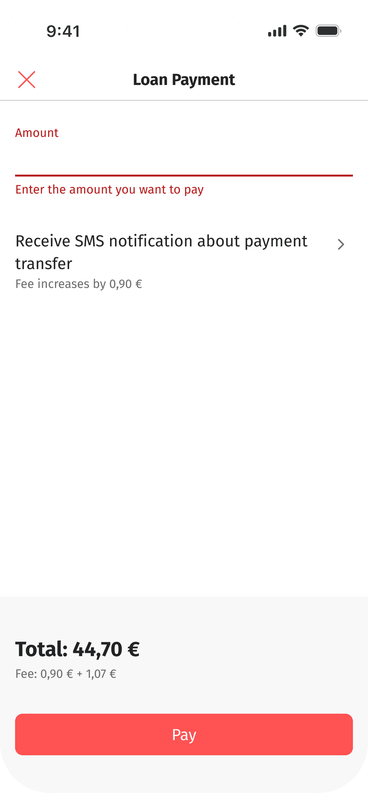

Blocking the button is not enough on its own. The message has to say exactly why, and by how much.
Default state of the screen. An empty field on open would feel like an extra step in most cases, where the user just wants to close the debt in full. We pre-filled the field with the full debt amount. "Pay everything" is still the default, but now it is a starting point, not the only path.
SMS toggle and its effect on the total. The SMS notification fee (€1) needed to stay clearly linked to the toggle on the same screen. Turn it off, and the user pays €0. Getting this pairing right mattered even more once we started testing the toggle's default state (see below).
The SMS toggle was mostly switched off. We tested where it should live.
Separately from the repayment redesign, product metrics showed something worth testing. The SMS notification toggle, a paid feature that tells the recipient the payment went through, was being switched off by most users. Only about 20% opted in. The business wanted to increase that number without slowing down the payment flow.
I designed three variants before we picked one to test.
Variant 1: toggle directly on the payment screen, default OFF (original state). The toggle sat right on the amount screen, switched off by default. It was fast to scan, but the low opt-in rate showed that most users left it unchanged without reading what it did.
Variant 2: toggle directly on the payment screen, default ON. This was the simplest fix: flip the default, keep it in place. The risk was that there was no space to explain what the SMS does and why it costs extra, right next to the amount field. Without context, users would likely just switch it off again.
Variant 3: separate screen, opened via a chevron row, default ON (shipped). We moved the toggle to its own screen with full context: what the SMS confirms, and why it costs more. We set it to on by default. The main payment screen only shows a one-line summary: "Notify recipient by SMS: commission +€1." This way, the user always sees the cost included in the total before paying, without needing to open the second screen at all.


The toggle moved to its own screen with room to explain itself. The payment screen just shows the resulting cost.
I designed three variants before we picked one to test.
We shipped Variant 3. It gave the toggle enough space to explain itself. This did not fit next to the amount field before. We also kept it on by default. The commission was never hidden. It is visible both in the summary row and in the final total ("Commission: €1 + €1"), so the opt-in increase did not reduce transparency.
Working with the team
One team worked on this: an analyst and platform developers (iOS, Android, web) covering the shared payment flow across express loans, card repayment, and cash repayment. Every change had to work the same way across all three loan scenarios, since they all lead into the same screen.
My part of the work was the edge cases and the screen logic itself. The original ticket only asked to "unlock the field." It did not mention what should happen on zero amount, over-limit input, or the default state. I walked through the new editable field myself, listed every "what happens if" case I could find, and wrote them up as annotated states for the analyst to turn into formal requirements. This meant each platform did not interpret edge cases on its own. For the SMS toggle, I designed both tested variants (different default state and placement), then worked with analytics to read the results together and turn them into a clear design recommendation for the next iteration. Because iOS, Android, and web were all building from the same screen at the same time, I kept one shared spec for the field validation and toggle behavior, so all three platforms stayed in sync.
What stayed out of scope
Recalculating the future payment schedule in real time when a user pays part of the debt: we discussed this, but did not include it in this round. The screen shows the total due right now, but does not automatically show how a partial payment changes the following months.
Summary
The ticket was written as "unlock the field." But the real work was giving the user back a decision the product had been making for them, without breaking trust in the number shown on screen. The SMS toggle test showed the same idea from another angle: a small, well-placed UI change, not pressure or dark patterns, was enough to shift real behavior and add measurable revenue, while keeping the flow just as fast.